50 Color Combinations You Need to Use
By Enina Bicaku May 19, 2023

People are visual creatures. We can’t help it! We’re influenced by the things we see, and color combinations have a major impact on how we perceive and react to things.
Color communicates on both conscious and subconscious levels, and where language can’t. The right color combinations can draw in attention, generate emotion, and ultimately leave a lasting impression.
With so much on the line, choosing the right color combinations can be difficult if you have limited design experience and time. So, we’ve covered the basics of choosing colors in a beginner-friendly way! You’ll find color inspiration for interior design, branding, beauty, fashion, and everything in between.
The color wheel and basic colors
All colors are made by mixing the primary colors red, blue, and yellow together in different quantities. It can be hard to believe at first but check out the color wheel below to see it in action.
By mixing two primary colors, you create a secondary color. By mixing a secondary color with a primary color, you create a tertiary color.
- Primary colors: Red, blue, yellow
- Secondary colors: Orange purple, green
- Tertiary colors: Blue-green, red-orange, yellow-green
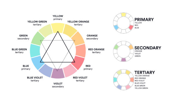
Keep this color wheel in your back pocket to reference how various colors are made.
Types of color combinations and how to use them
Choosing colors that look good together is actually simpler than you think. Using the color wheel and the tips below, you can find color combinations that work well together every time.
- Complementary colors: Colors that sit on opposite sides of the color wheel. They complement each other and work best when one is the main and the other is an accent
- Triadic colors: Three colors that are equally distanced from each other, forming a triangle on the color wheel
- Analogous colors: 2 to 5 colors that are next to each other on the color wheel
- Tetradic: 4 colors with one being primary, two being complementary, and one as an accent color. It forms a rectangle on the color wheel

Some of these color pairs may seem unusual, but you can use these color combinations with the confidence that they will work together. The color wheel has an incredible array of options when you factor in darkening colors with shade, or lightening them with a tint. The possibilities are endless!
Here are some ways colors can be altered:
- Hue: The unaltered original color
- Shade: Original hue darkened by black
- Tint: Original hue lightened by white
- Tone: Original hue shaded with gray

Best color palette generators
These color palette generators provide an unlimited range of color inspiration for any project. They’ll help you get a better idea of the colors you like and don’t like for your project, and which variations of hues resonate with you.
Color combinations and emotions
Aside from aesthetics, color schemes can be used to evoke emotions. Based on scientific research, colors and emotions are closely linked and can be used to enhance your messaging.
Here’s a quick rundown of colors and their emotional association.
- Blue: Loyalty, professionalism, trust
- Red: Strength, passion, confidence
- Yellow: Positivity, enthusiasm, happiness
- Green: Harmony, nature, growth
- Purple: Royalty, spirituality, wisdom
- Pink: Compassion, love, playfulness
- Orange: Optimism, youth, creativity
50 color combinations for any design
We’ve researched color trends from some of the great color trendsetters like Adobe, Benjamin Moore, Sherwin Williams, and Behr to curate the best color combinations.
Beneath each palette we’ve added HEX codes for every color, going from top to bottom, so you can easily copy them into your projects.
Choosing any of these color palettes will ensure your project is ahead of the color trend curve.
Three color combinations
Below, we’ve compiled color combinations of three colors that go together.
1. Pink and yellow

HEX Codes: #C7395F, #DED4E8, #E8BA40
This sweet spring color palette is bubbly and refreshing. Like spring blooms and sunshine, it has a light pink and fuschia color pair accented by a deep yellow. This warm color palette is great for seasonal designs, and for capturing the joy of spring and summer. It also works well for the beauty industry, and for adding a warm look to product packaging or social media assets.
2. Teal and tangerine

HEX Codes: #EDCBD2, #80C4B7, #E3856B
Orange and blue sit across the color wheel from each other, making them complementary colors. The warmth of the tangerine orange is balanced by the cool teal tone, creating a well-balanced color scheme. It’s a beautiful color combination for a fresh, dynamic look, and a youthful glow.
3. Prussian blue, orange, and mustard

HEX Codes: #3B5BA5, #E87A5D, #F3B941
A fresh take on a retro color palette, the Prussian blue and orange are complementary colors, accented by the mustard yellow. This warm color palette is great for retro designs that need a modern flair. Retro designs are trending in 2024, and this color combination is a great way to achieve the look.
4. Periwinkle, pink, and lime

HEX Codes: #678CEC, #D49BAE, #BBCB50
Periwinkle was the Pantone color of 2022, and this palette creates a bold impression with slime green and dark pink accents. It’s an unconventional palette ideal for those looking to stand out, break rules, and be daring.
5. Blue, green, and orange

HEX Codes: #4AAFD5, #91B187, #E7A339
This color palette emulates a clear summer’s day and the juiciness of a ripe orange. The crisp sky blue is offset by the sweet orange and accented by the soft green of leaves. It’s the perfect palette for adding an enthusiastic and natural look to your projects!
6. Blonde yellow, beige, and candy pink

HEX Codes: #F9EC7E, #E3CCB2, #E26274
Like fresh spring tulips, the striking yellow and the pink color combination is both delicate and eye-catching. Soft beige adds a sophisticated touch as either an accent or main color.
7. Raspberry pink and dark chocolate

HEX Codes: #B2456E, #FBEAE7, #552619
Mouthwatering and rich, the raspberry pink and chocolate brown are enough to make anyone drool. The light pink adds a buffer between the two, further accentuating the richness of both colors. It’s perfect for those in luxe desserts or more sensual businesses and design endeavors.
8. Sage and pine green

HEX Codes: #EDF4F2, #7C8363, #31473A
The neutral shade at the top of this color scheme has a green undertone, a great foundation for playing with the more moody greens below it. Greens can be vivid and refreshing, or deep and calming. We like this green color palette because, depending on how you use it, you can achieve either effect.
The green in the center intentionally resembles Sherwin Williams’ color of the year, Evergreen Fog, making this a popular color combination choice for 2024.
9. Light blue and cobalt

HEX Codes: #CADCFC, #8AB6F9, #00246B
This blue color palette is calming in nature and can be used in various applications. Analogous color harmony is on display here with a mixture of multiple shades of blue. Picture a relaxing rainy spring day. This toned-down color scheme is extremely flexible. Instead of bombarding the senses, it soothes them.
Muted color combinations are popular in 2024, achieve the look with analogous blue color combinations.
10. Canary yellow and lilac gradient and off-black

HEX Codes: #D3CAE2 #E6C17A, #F6EDE3, #404041
The aesthetic gradient of lilac and canary yellow is surreal yet soothing. It’s a balance of warm yellow and cold purple, creating perfect complements and a balanced gradient. Butter yellow and faded black act as accents to either cool the palette or warm it up.
Gradients are trending in 2024, so get ahead by using this beautiful set of color combinations.
11. Lilac, gray and orange

HEX Codes: #D5CAE4, #E1E5EB, #E59462
Orange and lilac entice two opposing emotions. Lilac is soothing and orange is energizing, creating a dynamic color combination that is exciting and unique. It’s great for projects that want to push boundaries and exude a modern vibe.
12. Primary colors with a bold twist

HEX Codes: #81CAD6, #EDCD44, #DC3E26
This bold color palette is unapologetic and striking! Leveraging the impact of primary colors in alternative shades, the light teal, vermillion, and yellow are simple yet unforgettable. For a design, vermillion and citrus yellow could be used interchangeably on font, borders, text boxes, and more. They would also work well layered over each other in these design elements.
13. Sunshine yellow, fluorescent green, sapphire blue

HEX Codes: #F2EC9B, #96FFBD, #1803A5
Exhilarating and strong, the electric blue is partnered with the fluorescent green to create a stand-out color pair. The pale yellow is a pacifying accent that still contributes to its overall electric look. It’s ideal for small designs that need to make a striking impact.
14. Graystone, teal, and emerald

HEX Codes: #D9DAD9, #68A4A5, #4C8055
This color combination pulls from the beauty of natural stone and flowing rivers. The gray of rocky shores is balanced by the emerald of deep waters. The muted blue is inspired by the sky or the fresh meltwater of a glacier.
This is the perfect combination if you prefer minimalistic designs but want to add a slight pop of color. Emerald green could be added for a font color while your background remains more toned down. This color scheme is fluid, professional and applicable to multiple industries.
15. Electric pink, azure, and powder blue

HEX Codes: #DF3C5F, #224193, #6F9BD1
The jolt of the electric pink is balanced by shades of blue, creating a bold and versatile palette. Opt to use the electric pink as an accent color, or make the blues accent colors to leverage the charge of the pink. This palette works for retro 90’s logo design or bold projects.
Four color combinations
Below, we’ve created color combinations with four colors that go together.
16. Blush rose, fuchsia, cobalt, and brown

HEX Codes: #E17888, #AE3B8B, #1C5789, #341514
Dark and mysterious, the fuchsia, cobalt blue, and brown are like a fiery sunset on a desert landscape. The blush rose is a soft highlight that illuminates an otherwise intense color scheme.
This palette is ideal for adding intrigue to your designs, it’s also a great option for luxurious interior design!
17. Blue, apricot, and red

HEX Codes: #3988A4, #67C2D4, #D0944D, #CB625F
Playful and energizing, this vintage color palette has cold shades of blue that are balanced by warm shades of apricot orange and dusty red. It’s great for bubbly personal branding that has a vintage flair. The accent neon blue is a great way to draw attention to specific messaging or elements in your designs!
18. Blue, mustard, mauve, and green

HEX Codes: #1D71BA, #EDC400, #B25690, #71B379
Instantly electrifying, this color combination is unique and playful. The warm yellow and purple are sandwiched by the cool blue and green to create a bright color combination. The shock impact is great for bold branding on food blogs, personal portfolios, and as accents on social media assets. This burst of color is hard to ignore!
19. Sand, umber, blush, espresso

HEX Codes: #D4B8B1, #866C69, #CD8C8C, #53331F
Taking after the sand, rock, and dust of a dune-like landscape, this palette would be arid if it wasn’t for the soft blush of pink. The sandy beige and umber are analogous to the dark espresso brown, creating a warm color palette.
It’s an ideal palette for beauty businesses, coffee shops, or designs that want to exude a grounded and warm look.
20. Turquoise blue and fresh moss

HEX Codes: #2963A2, #4CAABC, #72C2C9, #9FA65A
This analogous color combination is inspired by the alpine landscape, with the shades of blue emulating glacial lakes and clear skies. The green is the color of fresh moss after a downpour, breaking up the shades of blue to add balance.
This combination is ideal for designs that highlight nature, growth, and vitality.
21. Raspberry pink, cobblestone gray, and clay

HEX Codes: #D8D0CD, #B46543, #DF5587, #C83F5F
This playful palette has sweet raspberry pinks and a clay brown. It reflects fruity pink tones and a sweet milk chocolate hue, neutralized by a light cobblestone gray. It’s perfect for bakery branding or adding a warm, feminine look to your designs.
22. Walnut, Aegean blue, honey, persimmon orange

HEX Codes: #4D181C, #144058, #E58D2E, #DD671E
Rustic and nostalgic, this color palette is perfect for vintage branding, record stores, or 70s interior decor and fashion ideas! The walnut brown and honey yellow allude to leather couches and yellow corduroy pillows. The Aegean blue and persimmon orange add a balance of cold and warmth that creates an irresistibly retro color combination.
23. Strawberry pink, neon blue, and dark chocolate brown

HEX Codes: #D2385A, #DE9DC2, #9EE8E1, #573C33
Pink and brown are a mouthwatering color combination and are perfect for branding in the baking and pastry industry. The pink alone is playful and feminine, but when paired with brown it becomes more grounded and rich – think cake and coffee! The neon blue adds a unique twist that instantly renders the color scheme modern, fun, and totally unique!
24. October mist, sand, orange, and black

HEX Codes: #B7B9A8, #D1B5A3, #E36858, #0C0D0D
October mist was the Benjamin Moore 2022 color of the year, and it adds a stable and meditative look to the palette.
The October mist and sandy nude are offset by the accenting tangerine orange, creating a sharp look that suits interior design, branding, and website design. This palette is functional and modern, ideal for professional and creative uses.
25. Baby blue, salmon-orange, peach, and ruby red

HEX Codes: #CEE6F2, #E9B796, #E3867D, #962E2A
The crisp look of sky blue is paired with cheerful peach hues for a divinely refreshing look. The light colors are grounded by a deep ruby red, adding more versatility to your choice of accents.
This soothing color palette is great for branding a new product, designing a website, or creating youthful social media assets. They work well in the beauty industry and for interior decor ideas!
26. Pastel pink, teal, butter yellow, papaya orange

HEX Codes: #EECCD3, #80C4B7, #EEC95C, #E3856B
These playful colors are inspired by dawn on a summer day. The soft veil of pink balances the bright yellow of a rising orange sun. The teal and orange are complementary, creating a balance of warm and cool colors. Add these colors to any design for a young and cheerful look!
You could potentially create a very relaxing, trendy interior space by using this color combo. There’s something very peaceful about these colors that makes them easy to engage with. They are slightly childlike too, which would make them a great choice for decorating a child’s room.
27. Neon blue, mustard, powder pink, brandy

HEX Codes: #B6818B, #57BBBC, #B8912E, #802621
Like a dimly-lit antique shop, this palette is vintage-inspired but with a twist of bright blue to garner attention. It leans on darker shades of rustic hues to create a cozy and traditional look. The brandy red and mustard yellow are weathered and offset by the blue and powder pink. It’s perfect for rustic home decor, vintage posters, and product packaging.
28. Rustic orange, marigold, dirt brown, and beryl blue

HEX Codes: #CF9032, #CD7E2A, #6C3622, #6FA1BB
Inspired by the bright and earthy colors of autumn, this fall color palette is fresh but understated. Like the deep yellow of late autumn, it has a charming and cozy feel. The blue and orange are complementary, with the tanned yellow and orange creating an eroded look.
These colors work well for product packaging, interior decor, and wall colors!
29. Neon green, radiant pink, profound blue, purple

HEX Codes: #B6E696, #A95EA3, #DC3A79, #1686CD
Inspired by the 90’s color-block fashion, this neon color palette is rambunctious, loud, and light-hearted. The neon green, pink and blue are offset by the muted purple to create a fun and nostalgic look. This palette is great for fashion design, personal branding, and even makeup looks!
30. Dark sage, earth brown, and mahogany

HEX Codes: #507B6A, #6A513C, #A4998E, #4B1816
Bohemian and classy, this color palette is dark and luscious. It uses natural hues of cabernet red, ash beige, and walnut wood to create warmth. The jade blue adds a cold accent to level off the warmth in the palette. This palette is a stunning option for interior design and decor.
31. Minimal and modern greys

HEX Codes: #DDDBDE, #CAD4DF, #656E77, #3B373B
Sometimes using a minimalist color palette is the best way to make an impact in a cluttered world. By using subtle shades, you can rely on minimalist fonts to convey your messaging and let color be a soothing accent. Brutalism is a web design trend in 2024, and minimalist color combinations are perfect for executing that bare-bones look.
32. Sky blue, rose, fuchsia, and yellow

HEX Codes: #6FC7E1, #EABDCF, #EFD557, #CE6EA3
This fun-loving palette injects fun and child-like wonder into any design. It’s a great color combination for accents on websites, personal branding, and fun social media assets. It’ll uplift your mood and your designs along with it!
33. Disco purple, hot pink, lime, and slime green

HEX Codes: #BD5598, #82BB42, #BFCF6E, #DF3C5F
Funky and unique, this color palette is well beyond the color comfort zone. The mix of pink, purple, and green is striking and groovy. It’s original and fierce, but versatile enough to give you options for which color you want to use as an accent.
It’s ideal for creative industries, original personal branding, and branding unconventional items in groundbreaking (but fun) industries!
34. Tiger orange, corn yellow, sand, cyan blue

HEX Codes: #E88659, #D8BF58, #D1BAA2, #56C1E1
Channel a hot summer’s day with this relaxing beach palette. The hues are instantly soothing and reminiscent of vacations and carefree days. The neon blue is balanced by the more muted sand and orange hues and accented by the sunny yellow.
This palette is great for swimwear design, beauty products, and designing during warm seasons.
35. School blue, recess green, playful pink, snacktime orange

HEX Codes: #3B5BA5, #E87A5C, #469E48, #DE418E
This is a great example of a triadic color palette. A very youthful group of color combinations, the school blue is muted yet bold, while the bright pink adds depth. The grass green reminds us of recess and paired with muted orange, brings an element of the unexpected.
Combined, these colors work great for homeschooling brands, daycares, and other childcare or education-related projects.
36. Sunshine yellow, nude, deep pink, eggplant

HEX Codes: #FAEF7C, #E3CCB2, #E26274, #78589F
Inspiring and bold, this palette has a lighthearted vibe with bright yellow and sweet pink grounded by an eggplant purple. The nude neutralizes the bold colors and adds versatility for usage options. This palette can be used for creative projects, bubbly website design, and for personal branding or unique packaging.
37. MODE, a Sherwin Williams inspired color combination

HEX Codes: #355952, #EAB63E, #FAF6E7, #E37769
Inspired by Sherwin William’s master palette, MODE, this set of color combinations pulls together some of the toughest colors to combine with expert precision.
Cascades green, Bakelite gold, Highly-reflective white, and Rejuvenate coral. These four colors contribute to a maximalist palette that is extremely stylish. MODE is a creative exploration of color combinations, perfect for the adventurous designer or ambitious artist.
38. Perfect red, ochre, grapeseed, off-white

HEX Codes: #6061A8, #CE8F30, #F4F7F7, #ED3224
Perfect red offers power and passion to these unique color combinations. Off-white and periwinkle purple add elements of light and dark, while still creating a modern contrast.
The ochre yellow doesn’t overpower the combination like a brighter shade of yellow would. Instead, it adds a mature and grounded feeling. The presence of Veri Peri ensures that this is one of the trendiest color combinations around!
Experiment with color combinations in Looka’s logo maker!
39. Behr color trends

Source: Behr.ca Whisper white, sun-washed brick, breezeway, etched glass HEX Codes: #F4F2EE, #DCC2B6, #CED8DO, #DDE1E3
For interior designers and home decor aficionados, these color combinations are the Behr 2022 color trends. The Whisper White is creamy and perfectly accented by Sun-Washed Brick and Breezeway Green. When combined, they offer a gorgeous ensemble of soft, approachable colors.
This palette of pretty colors looks great as wall paints, accent pillows, and to create gentle illustration art.
40. Dark teal, amber, squash, vermillion

HEX Codes: #3A6D80, #F3CD53, #D56729, #9D402D
This earthy, Moroccan-inspired color palette is reminiscent of aged stone and eroded Moorish architecture. The warmer tones brighten and illuminate your design, while the dark teal acts as a complement by cooling the palette down. This palette is ideal for interior decor, wall color inspiration, and branding vintage or thrift fashion.
41. Wisteria purple, melon green, and lemon yellow

HEX Codes: #735DA5, #D3C5E5, #8EC9BC, #FBF5AA
As energizing as it is calming, we can’t get enough of this wisteria and lemon color combination. They deliver a gorgeous ensemble of soft, approachable colors.
It’s one of those clean color combinations that are invigorating to look at. It feels futuristic and modern, perfect for the beauty and fashion industries as well as designs looking for a captivating splash of color.
42. Space blue, violet, candy pink, mint green

HEX Codes: #22235F, #7A4D9F, #EB68A0, #A8DACD
Maximalism is a graphic design trend in 2024, and this palette embodies organized chaos. These stylish tints make for a superb color combination that has the ability to be loud and colorful without being intrusive and gaudy. This color combination is great for spirited illustration, abstract art, or product packaging design!
43. Navy blue, neon green, canary yellow

HEX Codes: #223E8B, #2249AE, #7EE05F, #FEFAAE
Supercharge your designs with this powerful neon color palette. The deep cobalt is analogous to the lapis lazuli blue, but the balance is jolted by the radioactive green and light lemon. This color scheme is bold and daring, made for projects that want to establish trust, and associate with revitalization.
44. Neon pink, neon green, fluorescent yellow, bright peach

HEX Codes: #F4B0F7, #9CFAD4, #EDF9A2, #F8B0B3
A dazzling neon color palette, we love the bright colors combined here. The candy shades are bold and exciting and can be used in all sorts of applications, from parties to social media, to product packaging, to wall murals!
45. Neon teal, vivid violet, baby pink, pale yellow

HEX Codes: #78FFC4, #DCAAE4,#FDC2E4, #FAF3DE
These four colors combine to make a super aesthetic palette. We love the soft kawaii colors paired together in a bright and joyful, yet soft and soothing way. These pretty colors would pair together almost anywhere, but we see them doing super well in social media posts and glitter-heavy party outfits!
46. Exuberant pink, magenta, grape, indigo

HEX Codes: #E8338B, #C13979, #5C2C90, #2A2E74
Explore many shades of pink and purple with this vivid color combination. Dark indigo offers a rich, moody shade that flows nicely into the brighter eggplant. Combined with two deep fuchsia tones, these four colors could make a beautiful gradient!
While these shades are vibrant in nature, purples can be used in less energetic settings too. Think exquisite multi-toned fabric or a peaceful galactic-themed design.
47. Black, Amethyst, Plum, butterscotch yellow

HEX Codes: #020202, #5351A2, #A254A1, #F6C845
Traditionally, these colors wouldn’t be considered colors that go together. But when used in the right ratios these four color combinations are actually pretty unique and eye-catching! The honey yellow and lavender purple add a rustic feel while the Very Peri periwinkle, the 2022 color of the year, lends a touch of trendy modernism.
What’s surprising is how grounding the black shade becomes. In a design, we recommend using black as font text, or small accents, while letting the other colors speak for themselves. Black can be overpowering if not used deliberately.
48. Coral, salmon, banana yellow, mint green

HEX Codes: #EC6D67, #F2AE7F, #FBF5AE, #CEE4B3
It’s hard to find four colors that go together as these do! We love the citrusy shades in this pastel color palette. Great for product photography, lifestyle shoots, gender-neutral baby showers, and more!
49. Rose, bubble gum pink, neon green, off-white

HEX Codes: #EFC6D4, #D950AE, #AAE847, #EEEDEE
Here’s a bright and unique four-color combination palette! Layer the neon green and neon pink with more neutral colors like rose and soft grey to create a real pop of color. Neon colors are trending in maximalism, and this palette is a great way to create dazzle viewers.
50. Sky blue, teal, seafoam green, chartreuse yellow

HEX Codes: #59C4EB, #5ADFDF, #77EFBD, #ECF8BA
This analogous blue color palette reminds us of the sea! Use these bright colors to liven up any of your designs while still keeping a sense of calm. Notice how the yellow pops when layered with the darker blue shades? We love the contrast!
Use these color palettes in your next project!
Choosing the right color combination can seem intimidating, but keep this guide on hand to stay inspired and on top of trending colors. Looka has applied the principles of the color wheel through AI to generate stunning logo color combinations.
Check out the Looka logo maker now!